After seeing some of this summer’s fair designs, the county’s HR department reached out to me to ask if I would make a logo for their new “mybenefits” initiative. I was stoked to design something for the county that would connect to their current logo, but still be unique – and a little bit more punchy!
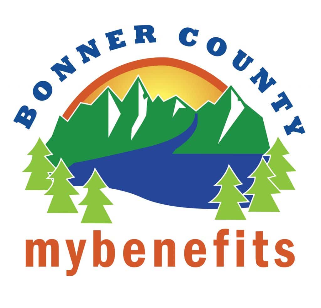
After a few modifications to our current logo, they ended up choosing this one, with the authentic North Idaho scene, especially Lake Pend O’reille, as the highlight. The fonts are super simple fonts that any computer would have. I wanted to make them versatile so that they can be adjusted/used and reused as needed. The fonts I used for this were: Rockwell Extra Bold & Franklin Gothic Demi Condensed.
Last week, another county department reached out to me to see if I would be willing to design another logo for their “Center of Excellence,” which provides all of our online and employee training. They wanted a similar logo to match the theme above, but with either a road sign, road, or something to think effect to show movement forward.
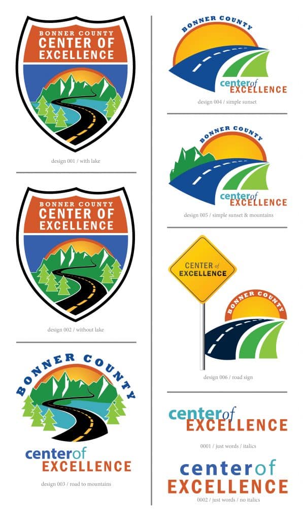
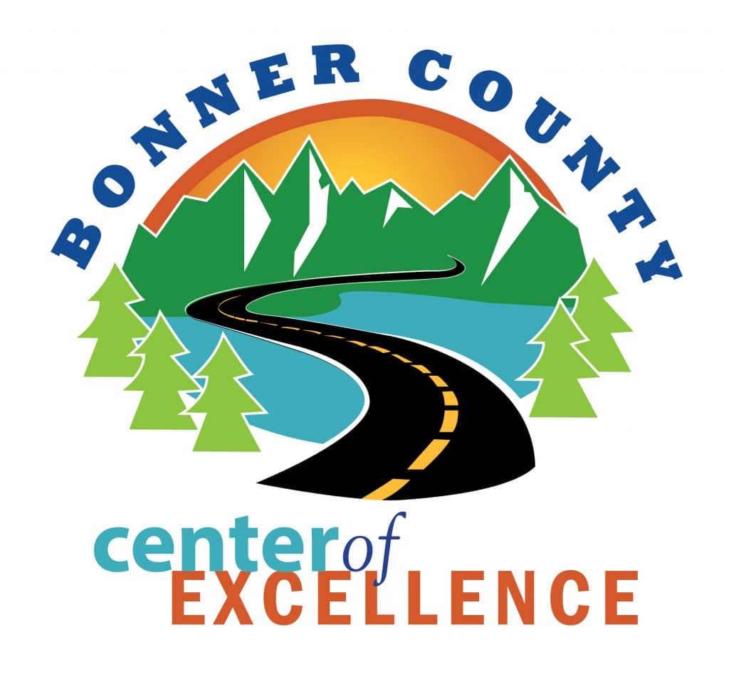
After receiving several versions of the logo, they choose design 003 / road to mountains. As you can see from the lower left corner above to this one below, I made several modifications. I decided the road shouldn’t go all the way into the mountains, and I adjusted the words for the “Center of Excellence” logo to include an italicized ‘of‘ to give it a little more punch. I switched my darker blue with the lighter as well, so that would pull the non-bolded text out a bit more.
It’s been really fun to start seeing these on their correspondence, in their email signatures, and on their mailers and county documents, and it’s a great way to do something that benefits this great county I live, work, and play in!


0 Comments